Next.js + TypeScript + MobX + Styled-components + Storybook
Next에 TypeScript, MobX, Styled-components, Storybook 까지 포함한 프로젝트를 세팅해보자.
Next 소개는 이전글에서, 완성된 코드는 Github에서 볼 수 있다.
설치
// 해당 프로젝트의 package.json
{
  // ...
  "dependencies": {
    "mobx": "^6.0.4",
    "mobx-react": "^7.0.5",
    "next": "^10.0.3",
    "react": "^17.0.1",
    "react-dom": "^17.0.1",
    "styled-components": "^5.2.1"
  },
  "devDependencies": {
    "@babel/core": "^7.12.10",
    "@storybook/addon-actions": "^6.1.11",
    "@storybook/addon-essentials": "^6.1.11",
    "@storybook/addon-links": "^6.1.11",
    "@storybook/react": "^6.1.11",
    "@types/node": "^14.14.12",
    "@types/react": "^17.0.0",
    "@types/styled-components": "^5.1.5",
    "@typescript-eslint/eslint-plugin": "^4.9.1",
    "@typescript-eslint/parser": "^4.9.1",
    "babel-loader": "^8.2.2",
    "babel-plugin-styled-components": "^1.12.0",
    "eslint-config-prettier": "^7.0.0",
    "eslint-plugin-prettier": "^3.2.0",
    "eslint-plugin-react": "^7.21.5",
    "prettier": "^2.2.1",
    "typescript": "^4.1.3"
  }
  // ...
}
Next, TypeScript
$ yarn create-next-app # 설치 중간에 폴더명 설정
$ cd 폴더명
$ yarn add next react react-dom

# typescript 설정
$ touch tsconfig.json
$ yarn add --dev typescript @types/react @types/node
$ yarn dev
타입스크립트를 사용할 때 필요한 next-env.d.ts과 tsconfig.json config가 자동으로 만들어진다. 해당 파일을 삭제하면 타입에러가 뜨니 삭제하면 안된다.
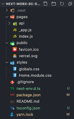 초기 폴더 구조
ESLint, Prettier
$ yarn add -D prettier eslint-config-prettier eslint-plugin-prettier eslint-plugin-react @typescript-eslint/eslint-plugin @typescript-eslint/parser
root 폴더에 아래 두 개의 파일을 만든다.
.eslintrc
{
  "parser": "@typescript-eslint/parser",
  "extends": [
    "plugin:react/recommended",
    "plugin:@typescript-eslint/recommended",
    "prettier/@typescript-eslint",
    "plugin:prettier/recommended"
  ],
  "plugins": ["react", "@typescript-eslint", "prettier"],
  "parserOptions": {
    "ecmaVersion": 6,
    "ecmaFeatures": {
      "jsx": true
    }
  },
  "rules": {
    "prettier/prettier": ["error", { "singleQuote": true }],
    "react/jsx-uses-vars": "error"
  },
  "ignorePatterns": ["*.config.js"]
}
.prettierrc
{
  "singleQuote": true,
  "semi": true,
  "useTabs": false,
  "tabWidth": 2,
  "trailingComma": "all",
  "printWidth": 80
}
Styled-components
$ yarn add styled-components
$ yarn add -D @types/styled-components babel-plugin-styled-components
Next는 SSR이기 때문에 styled-components의 babel 설정을 따로 해줘야 한다.
root 폴더에 .babelrc를 만들어서 아래와 같이 작성하자.
.babelrc
{
  "presets": ["next/babel"],
  "plugins": [
    [
      "styled-components",
      {
        "ssr": true,
        "displayName": true,
        "preprocess": false
      }
    ]
  ]
}
development, production에 따른 babel 세팅
{
  "env": {
    "development": {
      "plugins": [
        [
          "babel-plugin-styled-components",
          { "ssr": true, "displayName": true, "preprocess": false }
        ]
      ],
      "presets": ["next/babel"]
    },
    "production": {
      "plugins": [
        [
          "babel-plugin-styled-components",
          { "ssr": true, "displayName": true, "preprocess": false }
        ]
      ],
      "presets": ["next/babel"]
    }
  },
  "plugins": [
    [
      "babel-plugin-styled-components",
      { "ssr": true, "displayName": true, "preprocess": false }
    ]
  ]
}
원래 styled-component를 쓰면 console에서 Elements를 확인할 때 className이 암호화되어 식별하기 힘들다. 하지만 babel-plugin-styled-components를 설치하면 컴포넌트 이름을 붙여주어 어떤 것인지 알아볼 수 있으며, 디버깅할 때도 쉽다. 이 외, debugging, minification 등의 자세한 babel 설정은 공식 홈페이지에서 볼 수 있다.
이제 기존 styles 폴더 안에 있는 것을 삭제하고, User agent sheet를 초기화 할 reset과 전역에서 사용할 theme 변수 파일을 만들어보자.
styles/reset.ts
import { createGlobalStyle } from 'styled-components'

const GlobalStyle = createGlobalStyle`
  * {
    margin: 0;
    padding: 0;
  }
  html {
    font-size: 62.5%; // 1rem = 10px; 10px/16px = 62.5%
    height: 100vh;
  }
  body {
    box-sizing: border-box;
    font-size: 1.6rem;
  }
  a {
    &:link,
    &:visited,
    &:hover,
    &:active {
      color: inherit;
      text-decoration: inherit;
    }
  }
  input,
  select,
  button {
    -webkit-appearance: none;
    background: none;
    border: none;
    font-size: inherit;
    color: inherit;
    &:focus {
      outline: none;
    }
    &:disabled {
      cursor: not-allowed;
    }
  }
  a, button {
    cursor: pointer;
  }
  pre {
    white-space: pre-line;
  }
`

export default GlobalStyle
styles/theme.ts
export const size = {
  pc: '75em', // 1200px
  tab: '56.25em', // 900px
  mobile: '31.25em', // 500px
  mobileS: '23.125em', // 370px
}

const theme = {
  color: {
    primary: '#344E5C',
    secondary: '#4AB19D',
    point: '#EFC958',
    black: '#000000',
    gray5: '#444444',
    gray4: '#767676',
    gray3: '#C6C6C6',
    gray2: '#E6E6E6',
    gray1: '#E5E5E5',
    gray0: '#FAFAFA',
    white: '#FFFFFF',
    success: '#22bb33',
    danger: '#bb2124',
    warning: '#f0ad4e',
    info: '#5bc0de',
  },
  window: {
    pc: `@media screen and (max-width: ${size.pc}px)`,
    tab: `@media screen and (max-width: ${size.tab}px)`,
    mobile: `@media screen and (max-width: ${size.mobile}px)`,
    mobileS: `@media screen and (max-width: ${size.mobileS}px)`,
  },
}

export default theme
theme에 대한 타입을 지정 후, 다시 theme에서 import 한다.
styles/styled.d.ts
타입을 지정하는 파일의 이름은 무조건 'styled.d.ts'여야 한다. 아니면 자동완성이 뜨지 않는다.
import 'styled-components'

declare module 'styled-components' {
  export interface DefaultTheme {
    color: {
      primary: string
      secondary: string
      point: string
      black: string
      gray5: string
      gray4: string
      gray3: string
      gray2: string
      gray1: string
      gray0: string
      white: string
      success: string
      danger: string
      warning: string
      info: string
    }
    window: {
      pc: string
      tab: string
      mobile: string
      mobileS: string
    }
  }
}
styles/theme.ts
import { DefaultTheme } from 'styled-components'
// ...
const theme: DefaultTheme = {
  //...
}
pages/_document.tsx
import Document, { DocumentContext } from 'next/document'
import { ServerStyleSheet } from 'styled-components'

export default class MyDocument extends Document {
  static async getInitialProps(ctx: DocumentContext) {
    const sheet = new ServerStyleSheet()
    const originalRenderPage = ctx.renderPage

    try {
      ctx.renderPage = () =>
        originalRenderPage({
          enhanceApp: App => props => sheet.collectStyles(<App {...props} />),
        })

      const initialProps = await Document.getInitialProps(ctx)
      return {
        ...initialProps,
        styles: (
          <>
            {initialProps.styles}
            {sheet.getStyleElement()}
          </>
        ),
      }
    } finally {
      sheet.seal()
    }
  }
}
SSR은 사용자들이 요청하면 그때 미리 만들어 놓은 HTML을 먼저 보여주어 매우 빠르다. 하지만 styled-components는 자바스크립트이기 때문에 나중에 렌더가 된다. 즉, styled-component가 완전히 로딩되기 전에 페이지가 켜지기 때문에 스타일이 적용되기 전의 화면이 먼저 보이고, 화면 깜빡인 다음에 스타일을 불러온다. 따라서 위 처럼 ServerStyleSheet를 먼저 가져와야 한다.
pages/_app.tsx
import type { AppProps } from 'next/app';
import { ThemeProvider } from 'styled-components';

import GlobalStyle from '../styles/reset';
import theme from '../styles/theme';

function MyApp({ Component, pageProps }: AppProps) {
  return (
    <ThemeProvider theme={theme}>
      <GlobalStyle />
      <Component {...pageProps} />
    </ThemeProvider>
  );
}

export default MyApp;
본래 global에 있는 stylesheets과의 충돌을 피하기 위해, 개인이 설정한 CSS 파일은 오직 pages_app.tsx에서만 import 해야 한다.
pages/index.tsx
import Head from 'next/head'

export default function Home() {
  return (
    <div>
      <Head>
        <title>howdy-mj</title>
        <link rel="icon" href="/favicon.ico" />
      </Head>

      <div>Hello World!</div>
    </div>
  )
}
이제 yarn dev를 해보면 성공적으로 reset이 적용된 걸 볼 수 있다.
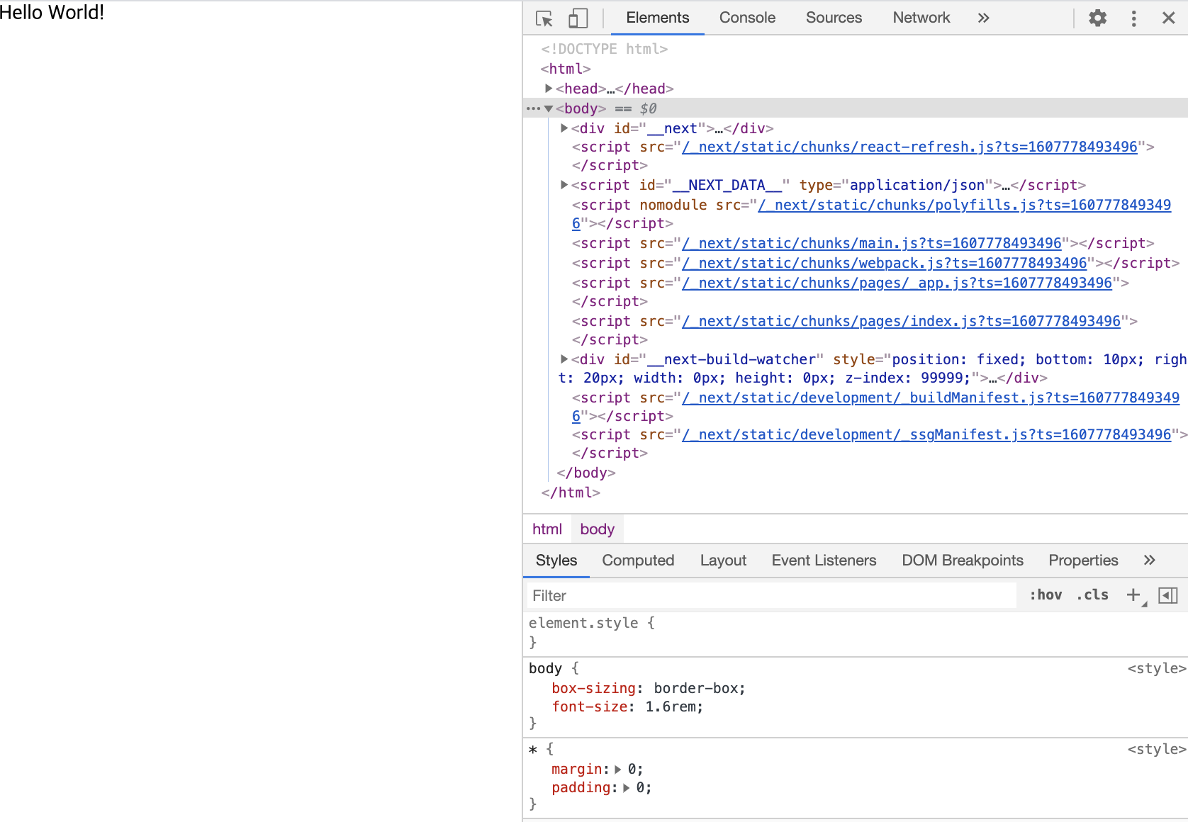 Styles에서 reset에 설정한 내용 확인 가능
MobX
$ yarn add mobx mobx-react
MobX 소개와 예제는 이전글로 대체한다.
함수형을 쓰기 때문에 별도의 Class config는 주지 않는다.
store/count.ts
import { makeAutoObservable } from 'mobx'

class Count {
  number: number = 0
  constructor() {
    makeAutoObservable(this)
  }
  increase = () => {
    this.number++
  }
  decrease = () => {
    this.number--
  }
}

const countStore = new Count()
export default countStore
pages/count.tsx
import { observer } from 'mobx-react'
import styled from 'styled-components'

import countStore from '../store/count'

const CountPage: React.FC = observer(() => {
  return (
    <div style={{ padding: '50px' }}>
      <div>
        <h1>Count</h1>
        <div>number: {countStore.number}</div>
        <Button onClick={() => countStore.increase()}>plus</Button>
        <Button onClick={() => countStore.decrease()}>minus</Button>
      </div>
    </div>
  )
})

export default CountPage

const Button = styled.button`
  border: 1px solid gray;
  padding: 5px;
  margin-right: 10px;
`
yarn dev 후, /count로 이동하면 정상적으로 작동하는 것을 확인할 수 있다.
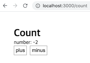 Next MobX 적용
Storybook
$ npx sb init
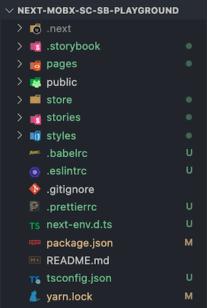 Storybook 설치 후, 폴더 구조
storybook을 설치하면 알아서 타입스크립트인 것을 감지하고 설정해준다. package.json을 가면 스토리북 관련 script가 추가된 것도 확인할 수 있다.
설치하고자 하는 라이브러리를 다 설치했으니, 폴더 구조를 다시 잡아보자.
components라는 폴더 안에 재사용될 컴포넌트와 stories 파일을 넣을 것이며, containers 폴더안 페이지 관련 코드들이 들어갈 것이다.따라서 root에 components, containers 폴더를 생성하고, stories 안에 있는 건 components 안으로 집어 넣자.
components는 storybook에 내제된 컴포넌트 들을 사용할 것이며, 이를 styled-components로 변경하는 것은 이전 글을 참고하겠다.
components안에 만들 Button, Header 컴포넌트 코드는 여기에서 볼 수 있다.
완성될 폴더 구조
.storybook
components
  ├─ Button
  │   ├─ index.stories.tsx
  │   └─ index.tsx
  └─ Header
      ├─ index.stories.tsx
      └─ index.tsx
api
containers
  └─ Count
      └─ index.tsx
pages
  ├─ _app.tsx
  ├─ _document.tsx
  ├─ count.tsx
  └─ index.tsx
public
store
styles
폴더 절대경로 설정
위에서 바꾼 폴더 구조대로, 절대 경로를 설정해보겠다.
Next는 static한 구조를 지니고 있어 React처럼 eject를 하거나 별도의 라이브러리(ex. CRACO) 없이 절대 경로 설정이 가능하다.
tsconfig.json
{
  "compilerOptions": {
    "baseUrl": ".",
    "paths": {
      "@api/*": ["api/*"],
      "@components/*": ["components/*"],
      "@container/*": ["container/*"],
      "@pages/*": ["pages/*"],
      "@styles/*": ["styles/*"],
      "@store/*": ["store/*"]
    }
    // ...
  }
}
절대 경로를 다 설정했다면, 아래의 파일들을 수정해보자.
개인의 취향이지만, 필자는 모든 로직은 pages가 아닌 containers 폴더에서 처리하기 때문에 모두 옮겼다.
pages/counts.tsx
import CountContainer from '@containers/Count'

const CountPage: React.FC = () => {
  return <CountContainer />
}

export default CountPage
containers/Count/index.tsx
import { observer } from 'mobx-react'

import countStore from '@store/count'
import { Button } from '@components/Button'
import styled from 'styled-components'

const CountContainer: React.FC = observer(() => {
  return (
    <div style={{ padding: '50px' }}>
      <div>
        <Title>Count</Title>
        <div>number: {countStore.number}</div>
        <Button label="plus" primary onClick={() => countStore.increase()} />
        <Button label="minus" onClick={() => countStore.decrease()} />
      </div>
    </div>
  )
})

export default CountContainer

const Title = styled.h1`
  color: ${props => props.theme.color.secondary};
`
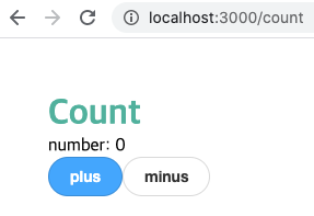
설정을 마친 후, 다시 서버를 켜면 아래와 같은 화면이 나온다.
완성된 코드: Github
참고